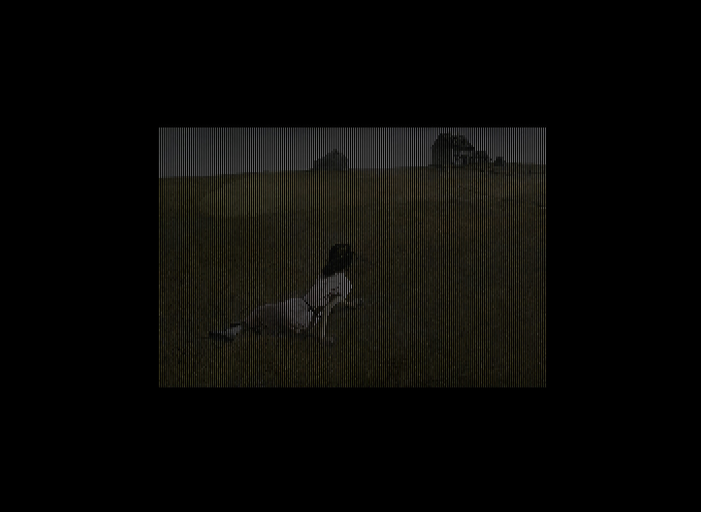
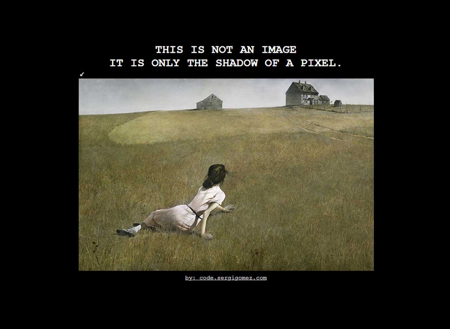
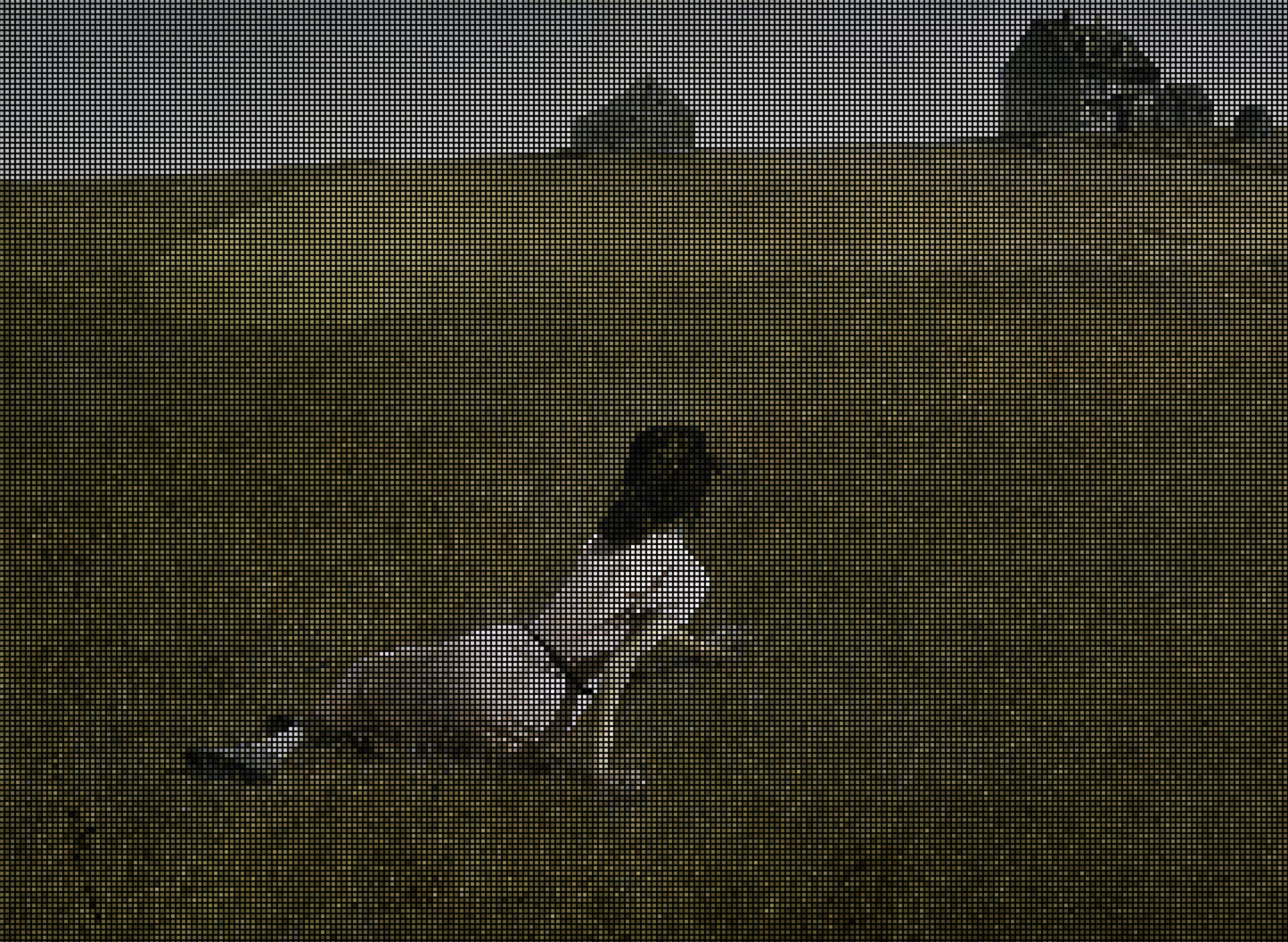
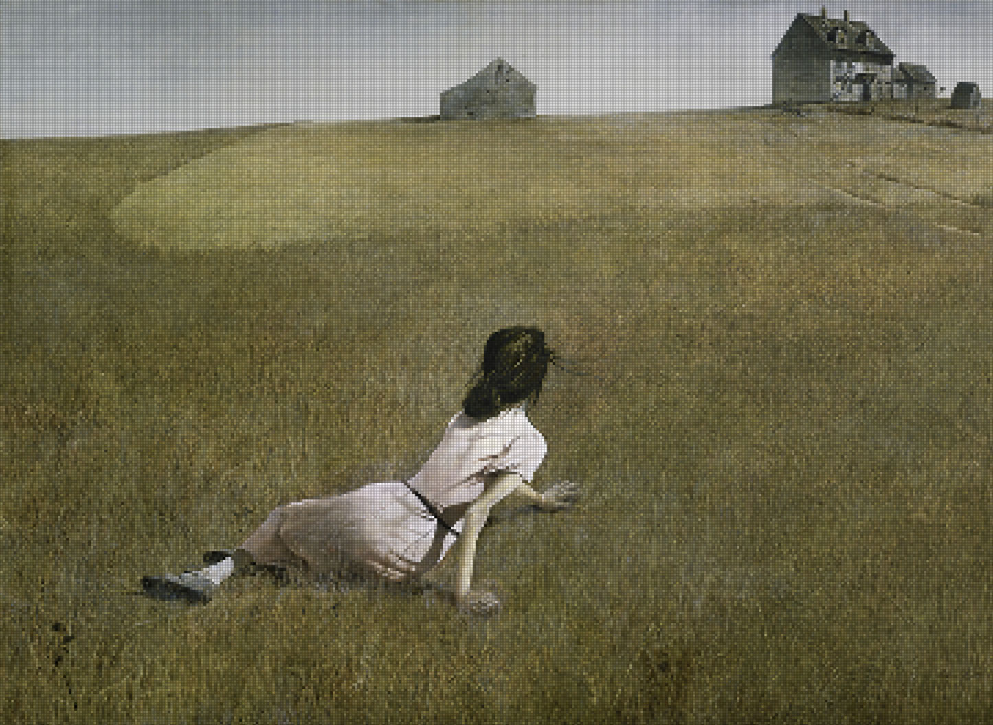
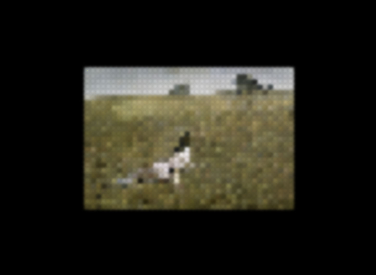
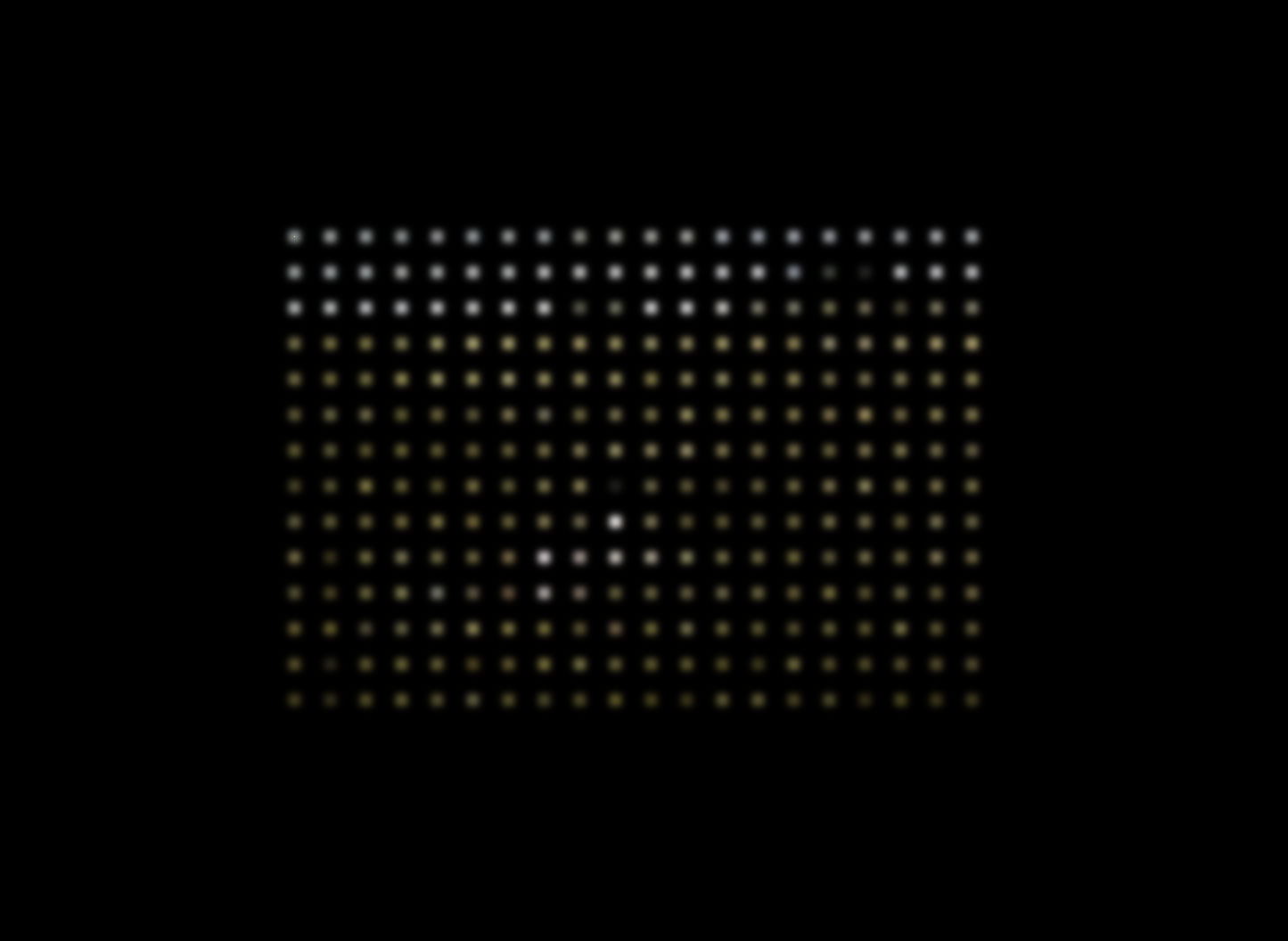
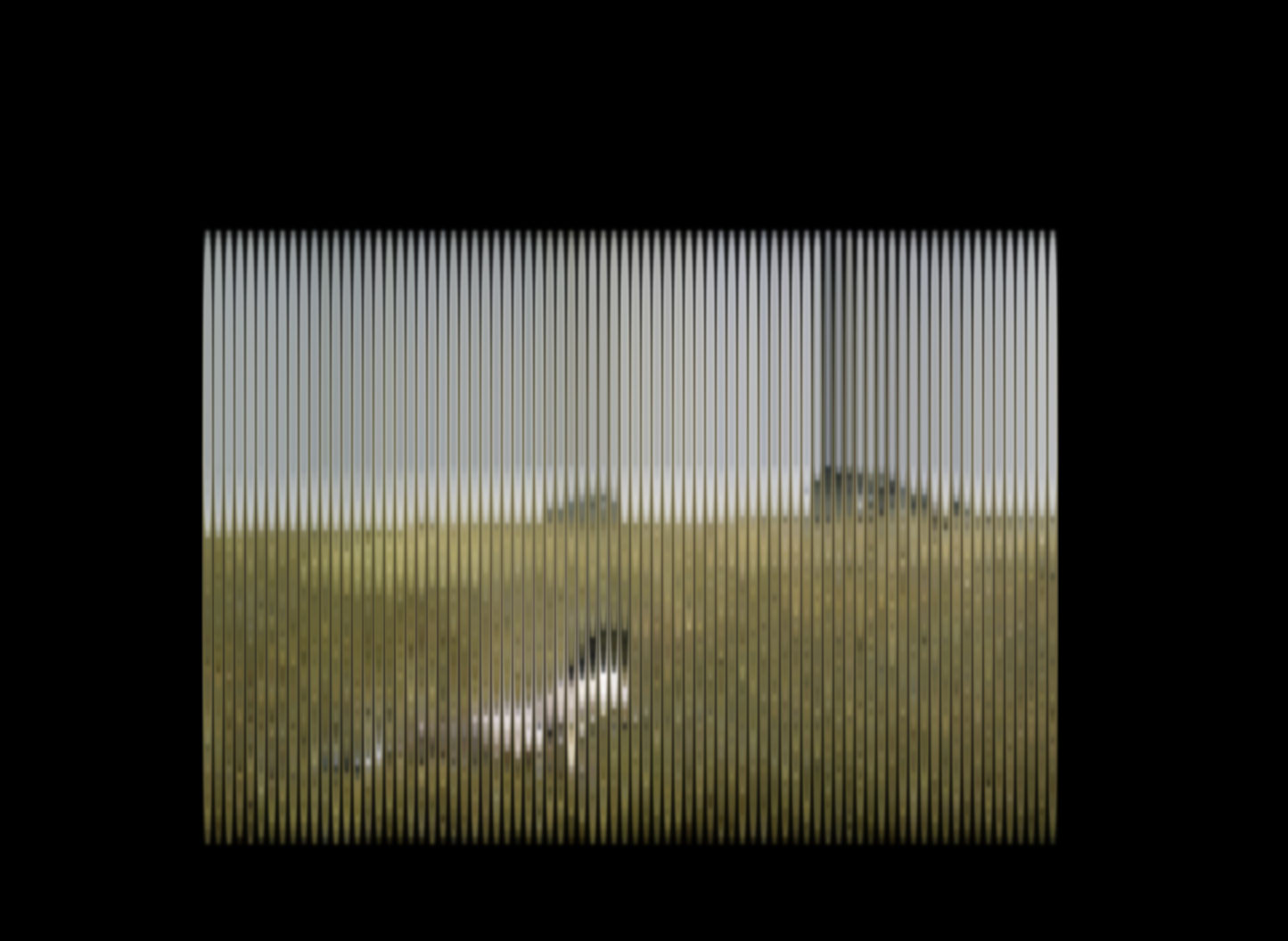
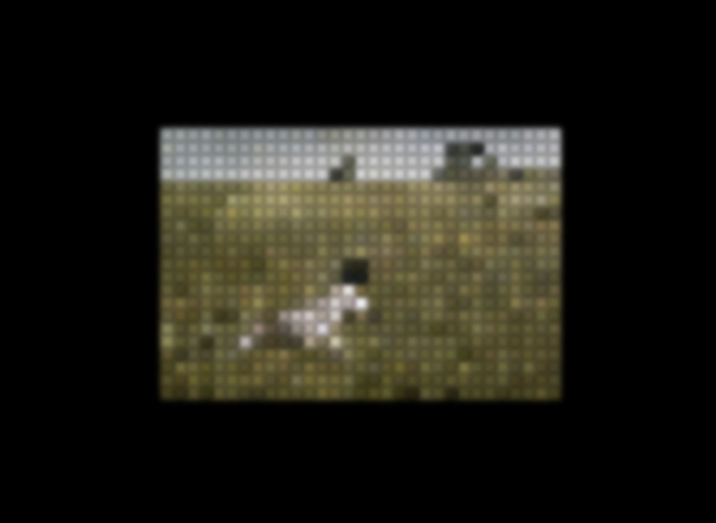
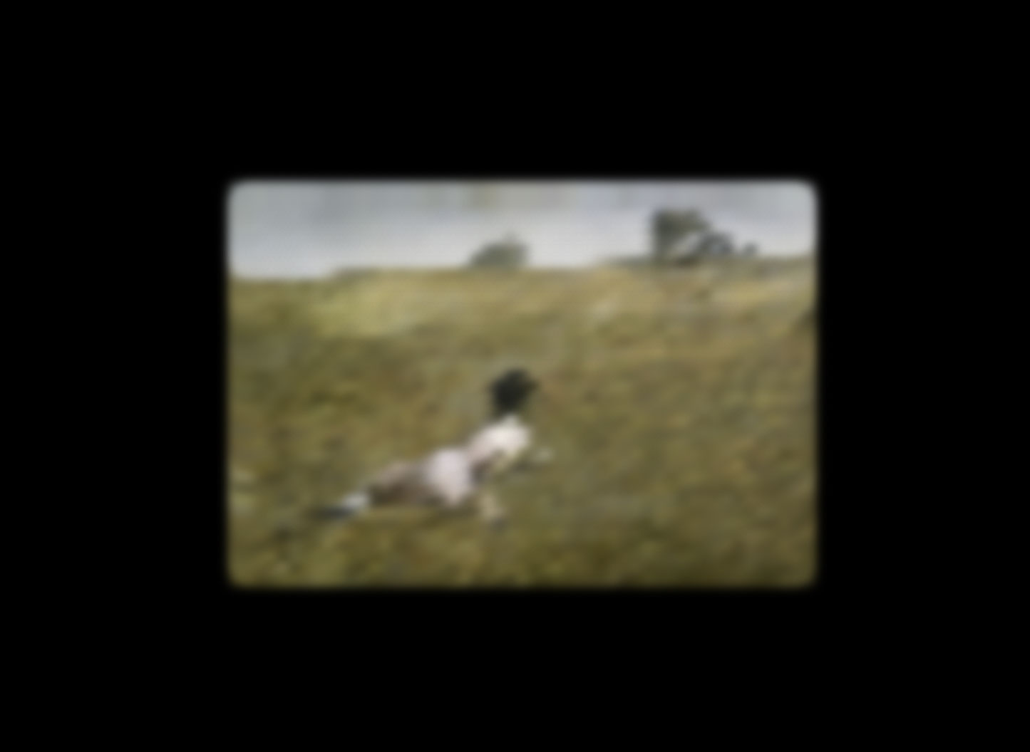
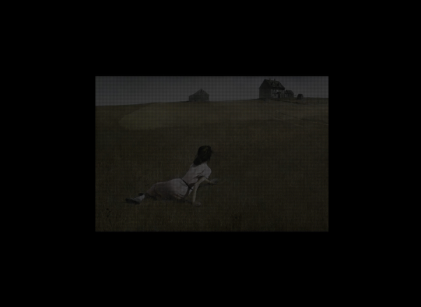
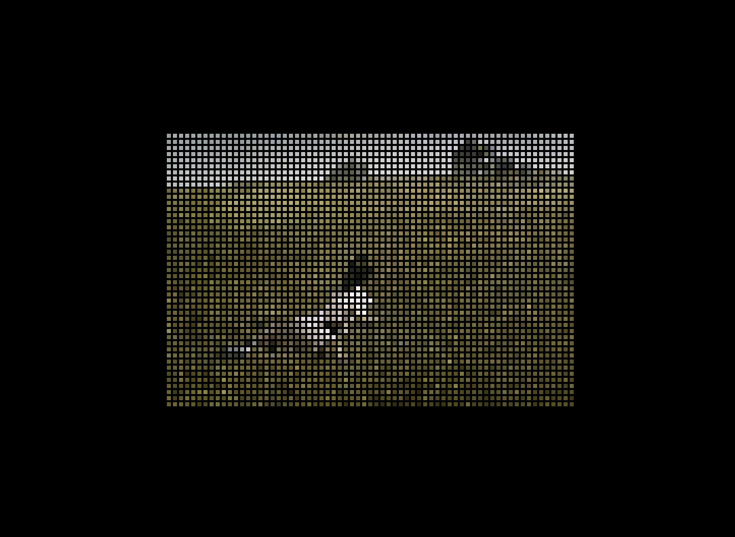
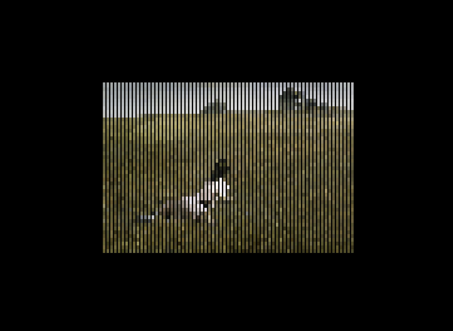
This is an experimental project made with Node.js that uses a CSS shadow-box to create pixels. This method transforms a real image into a CSS representation, converting each image pixel into a CSS shadow. This detailed process allows for creative exploration with pixel distance, blur, and other visual effects, opening new avenues in web design.
Technique and Applications
The technique, based on CSS classes, enables experimenting with transition animations, leading to a variety of dynamic and interactive visual effects. The examples included in the carousel illustrate the versatility of this method, showing how images with great detail can be represented in CSS, creating captivating visual effects.
Practical Considerations
However, it's important to note that the resulting CSS is considerably large, making the example impractical for use in current web browsers. Moreover, the images created are not traditional images but rather a CSS encoding of an image. This means they cannot be copied directly from the web as standard images. Therefore, this project is more about exploring the creative possibilities of CSS than its immediate practical application.
Related Article on Medium.com
I've published an article on Medium that covers this topic in detail. In the article, I provide a step-by-step guide on how to build this system. You can read it here.


